Role: UX Designer
Project: Community
Duration: September - December 2022
Project Goal
Community is a tool for those searching to give back to their local community. Our primary target is young adults and engorging them to get more involved in community service. This project aims to design a responsive tool that allows users to search from any device and create a brand-consistent design through all devices. The Community goal is to connect those looking to make a difference in their community to find the right volunteering opportunity.
Challenges
Design a user experience for social good
Provide a way for users to search and filter for the right fit.
Create a user-friendly interface.
Design an easy-to-understand user flow for registration.
Jessica is an IT at a tech firm. She has been looking for a way to serve her community in her free time. She wants to find something she's passionate about but also fits into her schedule.
Age: 24
Education: College degree
Hometown: San Antonio, Tx
Occupation: IT
Marcos is a University student looking to give back to his community. With work and school, he needs a way to quickly find a way to participate in his community that aligns with his busy schedule and is close to him.
Age: 20
Education: College student
Hometown: Austin, Tx
Occupation: Food delivery
Competitive Audit
An audit of a few competitors’ products provided direction on gaps and opportunities to address with the Community app. Some of the competitors I researched were The San Antonio Food Bank, WeHero, and Yelp.
Paper WireFrame
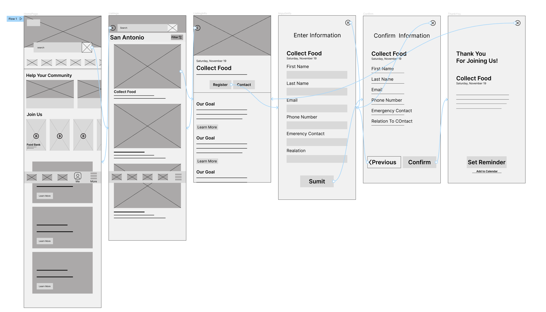
Low-Fidelity Prototype
After sketching, I created a low-fidelity prototype and connected all of the screens involved in the primary user flow of looking for volunteering opportunities and registering.
Pain Points
After creating a low-fidelity prototype, a usability study was conducted, which allowed me to see where the users had any problems or confusion when going through the primary flow of the Community app.
Registration
There was no clear way to ensure the users had successfully registered when they returned to the information page.
Filtering
Users wanted a way to filter the distance from where they wished to volunteer at.
Map
A couple of users raised concerns about the information not having an address or map of where the volunteering would occur.
Usability and Affinity Data
Conducting usability data allowed me to understand better what the user needs and the pain point the user had throughout the process. By using an affinity diagram, I could separate data together, allowing me to see similar patterns between the users. With these patterns, I could make updates to the app design to eliminate the pain points the participants encountered.
High-Fidelity Prototype
My hi-fi prototype followed the same user flow as the lo-fi prototype and included the design changes made after the usability study.
Clarity
On the low fidelity, users could not tell if they had successfully registered to volunteer. Some design changes on the high-fidelity prototype included indicating that the user had successfully registered on the information page and a way to cancel their registration. These changes illuminate any confusion when the user is returned to the information page.
Filtering
The user wanted a way to filter out distance when searching where they could volunteer. I added a filter on the high-fidelity prototype so they could easily adjust their travel distance when searching for a volunteering opportunity.
Map
The low fidelity needed a map to let the users know the address of where the volunteering would take place, and some users were concerned about not having a map. I made sure to add a map that would give them directions to the address where the volunteering would take place.
Take Away
The community app was the first social good project I had worked on, and as someone that has volunteered, I wanted to create a design that users would love using and that was welcoming. By researching competitors, I got a good idea of how to design a community service-based project. Keeping in mind the user and their needs allowed me to create a user-friendly flow and illuminate any pain points in the primary flow.


